The Shared Mind: What Color Perception Teaches Us About Meaningful Design
What gives color its meaning? Why does red feel urgent, blue feel calm, or green feel fresh? Marketers and designers have long understood the emotional power of color—but a recent study (“The origin of color categories.” Garside et al., 2024) published in PNAS pushes this understanding further, into the foundations of human cognition.
By comparing color categorization in humans and macaque monkeys, researchers explored a fundamental question: Are shared concepts hardwired, or do they emerge through language and culture? The findings offer both scientific insight and strategic implications for brand communication.
Color Is Not Just Seen—It’s Understood
The study used a non-verbal color matching task to assess how individuals grouped colors. Humans showed remarkable consensus in how they clustered hues—suggesting shared mental structures for color categories. Macaques, by contrast, displayed highly individual and localized responses, with no clear pattern across subjects.
Interestingly, one monkey appeared to form a unique but consistent categorization—suggesting that while the biological capacity may exist, the formation of shared categories likely requires something more: language or higher-order social cognition.
Why This Matters for Marketers
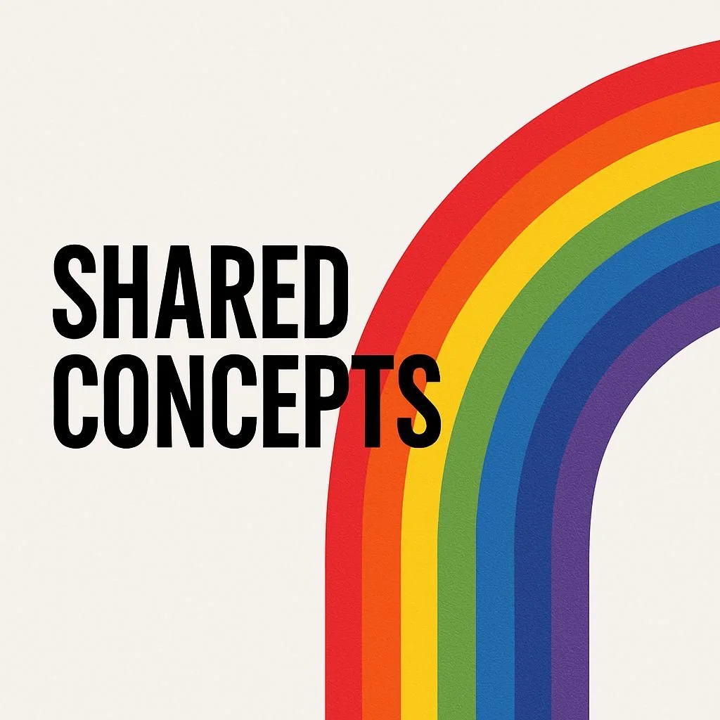
The rainbow is continuous light—but we don’t perceive it that way. Instead, we “see” red, orange, yellow, green, blue, and violet as distinct bands. These divisions aren’t objective features of the world; they’re mental constructs. And yet, they emerge reliably across cultures, languages, and time.
This research reveals that the way we structure perception is not arbitrary. It’s not simply a product of culture or marketing trends. Instead, it reflects a consistent interplay between our biological systems and the conceptual scaffolding that language and shared cognition provide.
For marketers, that means color—and design more broadly—resonates when it aligns with how people already see and understand the world. When visual communication taps into shared perceptual tendencies, it feels intuitive, trustworthy, and emotionally effective.
From Color Theory to Cognitive Strategy
Too often, brand identity decisions rely on personal preference or trend-driven aesthetics. But effective design isn’t just “what looks good.” It’s what makes sense to the shared mind.
Red can signal urgency not only because it’s culturally associated with danger, but because it activates biological responses (e.g., increased heart rate).
Blue evokes calm, stability, and clarity—not just in Western branding, but across numerous global contexts.
Green, often associated with nature or freshness, mirrors the environmental cues our brains evolved to interpret as safe or nourishing.
When marketers understand that color categories and meanings emerge from shared perceptual structures—not from individual taste—they can design messages that feel more natural, persuasive, and enduring.
Brainsuite: Designing for the Shared Mind
At Brainsuite, we help marketing and brand teams move beyond aesthetic guesswork. By using computational neuroscience, our AI-platform evaluates creative assets based on how the human brain actually processes visuals, language and audio.
Brainsuite AI-apps empower teams to predict which message the ‚shared mind’ will take-out from a visual to switch from personal opinion to data-based decisions.
Curious how neuroscience can make your design strategy more intuitive and effective? 👉 Discover Brainsuite
Sources
Garside, D., Witzel, C., & Franklin, A. (2024). The origin of color categories. Proceedings of the National Academy of Sciences, 121(14), e2400273121. https://doi.org/10.1073/pnas.2400273121PNAS+2PNAS+2PNAS+2